In order to judge the quality of my magazine and find out how well I satisfied the intentions and purposes that I laid out at the beginning of the project, I must not only look at it myself and make my personal opinions clear, but I also need to find out how well my target audience think I did, as their opinion is the most important one as they would be the ones who would potentially buy my magazine.
I have given my production work our to a few people who I would consider to be my 'target audience' and asked them to write a couple of sentences each outlining what they thought was good and bad about my production work.
Sonny: "I thought the the magazine as a whole looked professional and it gave off quite a cool vibe. If i saw this in a newsagents I would probably buy it because it's not to expensive and I would definitely recommend it to my mates."
Pheobe: "The front cover of the magazine was the best page, but they were all good. I liked the colour scheme and how he used the splashes because it made it look quite edgy and cool. But I think that he should of looked at a few new, up-an-coming artists instead of allready established artists"
Thomas: "I thought that the photos he took were really good, in most magazines the pictures look really fake but these ones were authentic, they look as if some one had just took a picture of their mate when they were hanging out. I think he could of improved the contents page as it wasn't that clear about pages and stuff because the text was quite bunched up"
Monday, 14 December 2009
AUDIENCE FEEDBACK
Monday, 7 December 2009
EVALUATION OF FINAL PRODUCT
-In what way does your magazine use, develop or challenge forms and conventions of existing music magazines?
From my research of other hip hop music magazines such as XXL, they all seem to approach the reader in the same way, in your face and sometimes hostile, with dark, sinister colour schemes and dominant, menacing images that visually threaten the reader to a degree, and aggressive feature titles on the front page that use minor curse words and slanted text. They also seem to share the same values: success, money, power, as their front covers are more often than not centered around a stern looking, dominant male figure covered in expensive clothing and gold jeweler and accessories, or “bling”. These returning features of hip hop music publications cement the already dominant negative stereotype of hip hop listeners and artists, when in fact most people interested in and who follow hip hop are nothing like the cultural preconception of ‘hip hoppers’, and in fact the opposite can be said about a lot of the people I will be trying to reach with Sample. So In this way, I think my magazine will destroy the common negative stereotype of people who listen to hip hop.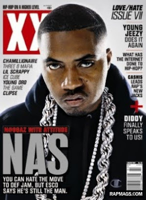
I also think that the fact that my magazine focuses on the UK hip hop scene as a whole, I separates itself from most, if not all other music magazines, as it is the only publication I know to look at and include articles about aspects of the scene in which the genre is based apart from the just the music.
-How does your music magazine represent your chosen target audience?
My magazine represents the UK hip-hop social group as it adopts a mature approach, which a lot of my target audience can relate to, however, my readers also like to relax as I have learnt from studying them first hand, so I have tried to give off a relaxed vibe with my magazine.
From my questionnaire, I learnt that a majority of my target audience enjoy and are interested in other aspects of the UK hip hop scene, therefore I made sure my magazine also looked at different aspects of UK hip hop, thereby satisfying all my readers needs in a magazine.
-What kind of institution might distribute you magazine?
I think my magazine could possibly be sold at newsagents and other publication distributers, as my target audience regularly visit off licenses and newsagents in their daily lives. I think it would compete well against other magazines in shops as I designed it to stand out with the bold lettering and “warning” colours(black and yellow).
However I think my product would sell best in hip hop gigs and open-mic nights across the UK, as the people who would buy tickets to and attend these sorts of events are exactly the same people who I would expect to buy my magazine. In the same thought process, I think my magazine would sell well at shops like charhart, Fenchurch and hip hop record stores as the customers they get are the same customers I expect to purchase my product.
-Who do you think your audience would be for your music magazine?
I think that my magazine would be aimed at 16-23 year olds as it is relaxed but it still takes itself seriously, and that is the general age of the people I have met who are into this type of music. My audience will be mainly male as the UK hip hop scene is a very masculine one possibly due to the lack of women mc’s and graffers. My audience will mainly live in culturally rich cities as it is a community based genre, centered around hip hop nights and graffiti jams etc. however for those that live in more “out of the way” cities, I believe that my magazine could bring the culture to them.
-How did you attract/address the audience for your music magazine?
I would attract my potential readers to buy my magazine by advertising in a variety of ways. One way would be to link up with gig promoters and event organizers and get my logo on flyers and advertise the availability of purchase at these events on the flyers. I could also organize my own nights, and name them after the magazine and again, have my magazine on sale at these events. Another way of promoting my publication is to create a graffiti team who could paint various murals based around my masthead in different legal spots around the UK. All of these ideas would be perfect ways of promoting my magazine as they specifically target my audience.
-What did you learn about technologies from the process of constructing this product?
As I have completed a GCSE in Media and infrequently use photoshop for various homeworks and projects, so I was already fairly confident with the software when it came to creating my product. Before starting the front cover, contents page and feature, I already had a grasp on the tools that were necessary for different tasks and I knew how to confidently use them to my advantage, however I had not used the program for an inordinate amount of time so my photoshop skills were rusty to say the least. While creating my product, I got a firm grasp of the various shortcuts that the program has to offer which greatly speeded up the process of design, I also gained confidence in using layer styles to add shadow, glows and highlights to a layer, the magic wand and lassos to cut and crop certain sections of an image out whilst leaving other sections in, and many other useful tools and techniques that helped me confidently create a well-designed, high quality magazine.
-Looking back on the preliminary task, what do you feel you have learnt in the progession ion the progression from it to the final product?
I learnt from my preliminarily that composing a magazine page takes time and requires alot of patients. I also become more confiedent with the program photoshop than before, and felt confident when approaching that final task that I could produce a quality magazine with the program as I was more knowledgeable about the tools and techniques nescessary for composing a good front page, contents page and two page feature. I also employed alot of the features that I used in my preliminary task and incorperate them into my music magazine, for example, the paint splashes were a good way to add substance and flavour to an otherwise lifeless and lacking front page, and I used them to good effect in my music magazine.


FLATPLANS
Before I start working on my magazine on the computer, I have to sketch up my design so I know what goes where and I will know before it's too late weather the composition works. However I had some problems with the scanner at my house and the ones at school and as a result I was unable to put up an image of them.
PRELIMINARY TASK
Before I design my Music magazine, I will create a front page and contents page for a school arts magazine. This will get me associated with the program photoshop, its tools, shortcuts and the various different techniques that are key to becoming confident with the program and producing a quality magazine page. The preliminary task will also give me practice in everything that goes into making a good magazine, ie. taking photos, composing a page and magazine style writing.
Before I design it on photoshop, I have to sketch it out so when I come to doing it on the computer i know what goes where.

I have learn from my preliminarily task to start work on my magazine sooner rather than later as composing a magazine page takes time and requires alot of patients. I have also become confiedent with the program photoshop, and feel that I can produce a quality magazine with the program as I am knowledgeable about the tools and techniques nescessary for composing a good front page, contents page and two page feature. I will also employ alot of the features that I used in my preliminary task and incorperate them into my music magazine, for example, the paint splashes are a good way to add substance and flavour to an otherwise lifeless and lacking front page, and I will definately be using them for my music magazine.
COMPARING LANGUAGE USED IN MUSIC MAGAZINES
In NME, the writers use a jokey, laid back style of writing that uses various literary techniques like puns, alliteration and humour to make the readers feel relaxed while reading the articles and features, however I think that at times, this comical style can be seen as tacky and when reading it myself I felt that the magazine should be taking me, the reader, and their artists more seriously as I expect their target audience to be around my age (16).
Black Beat is a magazine that whilst focusing on the artists of popular black culture, adopts a style is common in magazines like Heat, OK and Star, they seem to talk a lot about the gossip involved in the music industry and less on the actual music being produced by the artists. It is written in a very laid back and light-hearted way but at times the writing style and its content can come off as trashy. This magazine is obviously not aimed at anyone above 17 and due to it focus on gossip, I can imagine a lot of male readers not being particularly interested in Black Beat.
Q takes a much more serious approach when writing its articles and reviews. The magazine is aimed at 20-40 year olds as it uses mature language and intelligent word choice and syntax. However at times when reading Q I felt I couldn’t relax, and I think that a lot of readers could feel un-settled while reading Q due to it highly intellectual method of approach.
For ‘Sample’ I hope to combine Q’s style of writing with NME’s. A mature and intellectual style so that readers feel I am taking them and the music seriously, but I also want to created a relaxed environment where readers can feel at ease, almost as if they’re just hanging out with friends, as my magazine is very focused on sociality and community.
Sunday, 6 December 2009
WRITING OF ARTICLE
As part of the project, we have to produce a two page feature on a made up artist, and obviously, to create a feature on a musician you need an article. I will write up a two page article on my featured artist Loop, a hip hop artist releasing his new album: Back to Business.
The most important part of writing a good, in depth interview that relates and appeals to all aspects of our readers interests. The following are questions I will be using:
1.So before we go into you current career, lets start from the beginning, how did you first get into the UK hip hop scene?
-This question was used to satisfy readers who are interested in perusing a career in UK hip hop, as "Loop" will give advice about how to enter the scene to aspiring artists.
2.You say you used to be into graffiti when you were younger? Are you still into that scene? How has graffiti affected your life? What do you think about its connection to UK hip hop?
-This Question was for the readers who are interested in Graffiti as they can learn about how graffiti artists can become successful rappers, and also so that they feel they have gained a deeper relation to Loop.
3.So, Loop, when you first released “Back to Business” did you have any idea of the success it was going to bring and if you had to what was you say was the main factor?
-These next 3-4 questions are included in order for the readers to learn what "Loop" has been doing since they last heard him, as being knowledgeable of what artists are doing and therefore feeling involved in the scene which is key to the magazine.
4.So I can’t imagine it was easy deal with the sudden success of the album, how did you cope?
5.Do you feel you have changed much as an artist since you dropped “back to business”, in terms of how your sound has progressed?
6.Do you feel you have changed much as an artist since you dropped “back to business”, in terms of how your sound has progressed?
7.And how about from what you’ve learnt about the industry? We always hear about how much of a struggle it is, do you feel you’re in a better position now to “play the game”, or is it still a real battle to get things done your way?
-This question was included to give readers an insight into the music industry for readers who are interested in perusing a music career.
8.You have featured on a lot of mix tapes and albums also, how did you personally get those link ups?
-This question was included to give readers who are interested in pursuing a music career advice on how to get onto other artists tracks, a brilliant way to get yourself known in the music scene.
9.What do you feel about the prejudices against hip-hop? The way people associ-
ate it with anger and call it gangster rap etc? Do you feel that sometimes you’re fighting a losing battle?
-This was a question that relates to all readers as the state of the hip-hop scene and societies views on it are important to anyone who listens to UK hip-hop.
10.It’s hard to get yourself a name in music today, what would you advise to people who are just starting up?
-This question is for readers who are interested in pursuing a music career as the answer will give readers advice onto how to start a successful future in music.
11.So lastly, what do you think you’d be doing if you weren’t doing music?
-This question was intended to show readers the importance of music an/or a passion in young peoples lives to give them direction.
I will also write the answers in order to ensure that the article contains quality answers that appeal to my readers.
MASTHEAD DESIGN
Every magazine, music or otherwise, has a masthead or logo. This is usually the name of the magazine written in a style that is reflective of the magazine itself and its' genre. Designers of mastheads will use font styles, colour, sizing of text, positioning and other effects to create a masthead that successfully represents the magazines personality so a potential reader will get a clear idea of what a magazine is about from the first time they see it. The best mastheads on the market are ones that are bold and powerful so they are easily remembered by and therefore reinforce the brand identity in a competitive music magazine market.
I created a few different mastheads, all drawing influences from various other magazines, and all with positive points and negative point to them, but now I have to decide which one to use.
This masthead is good because it puts across the gritty, underground aspect of my magazine with its use of cracked lettering and an un-refined splash beneath the text. However, I don't think this a memorable enough masthead and is too similar to what i had planned for the feature teasers on my front cover.
This masthead is very similar to the one i used for my preliminary task, the different letters successfully represent the construction of a music beat, in particular the use of samples in UK hip hop music. However i do not think it’s directly reflective of my chosen genre and does not put across the idea of underground music.
This masthead is good because it it is a strong, bold design which will result in a successful brand identity as it is very memorable, due to the oversized, unconventional S, which could possibly be used later for a logo or symbol for my magazine. However i think the font i used could be improved with a font similar to my first masthead.
This masthead uses the large 5 for the S as it is a powerful ans memorable symbol that is easily recognized. The text used for the other letters is gritty and raw reflecting the style of my magazine. The colours I used are dynamic yet cool, also reflecting the style of the magazine.
Wednesday, 2 December 2009
FRONT PAGE IMAGE
For the front page of my music magazine, I must choose an image to use as a main photo. A main image in a music magazine is typically a mid shot of the most important artist in the magazine that week. I have taken a series of photos and now I must choose which one to use.
This first image will be the one I use for for my front page as it is a mid-shot, the typical shot used for a magazine front page. I also like the background on this photo as it appeals to my target audience, as they spend a lot of their time on the street and this photo is typical of a situation that my listeners would find themselves in regularly. The north face jacket that the artist is wearing is almost synonymous with the social group that my magazine is aimed at and the jacket and brand is very respected among my target audience so this immediately provokes a positive response to the artist and the magazine and creates a relationship between magazine and reader. I also like the way 'Loop' is looking to the side putting across the idea that this is a cool, relaxed magazine where the artists aren't so different to the reader and they aren't treated as celebrities.


MASTHEAD RESEARCH
This masthead is for the popular music magazine, NME. The lettering is bold, due to both the bright colours, the large font size and the sharp corners; this is done to suggest the magazines loud, boisterous attitudetowards the music, and the hard-hitting style of the magazine and its content. The name, “new musical express” is very basically stating the magazines purpose by use of word choice, “new” showing you that it is a very up to the moment magazine, “musical” stating clearly what the magazine is about, and “express” showing the fast-paced qualities of the magazines content and its approach. The typography of the “new musical express” suggests, in the same way as the “NME” a hard-hitting, no nonsense method of approach to music. The colour scheme of the masthead represents a passion for the music that the magazine shares with its readers.

Tuesday, 1 December 2009

FRONT COVER COMPARATIVE ANALYSIS
The two magazines I looked at were “XXL” and “Kerrang”, I chose these two magazines because they are extremely different to each other in genre, audience, fashion etc. however, they are both similar in method, layout, approach etc. as they are both music magazines.
“XXL”’s masthead is predominantly visible but the main image of the cover is blocking a section of it, this is also apparent in the “Kerrang” cover, this is a technique used by many music magazines (rolling stone, nme, black beat etc.) to indicate confidence in brand identity, as they are so secure in the knowledge that their logo/name is recognizable to the public, that they are willing to make it partially concealed. The coverage of the masthead also suggests the importance of the artist/artists on the magazines front cover, which simultaneously boosts the credibility of the magazine itself.
There are several elements to the covers that are consistent in both magazines but also in most if not all music magazine covers. A masthead is a key feature for a music magazine, it gets across brand identity, but also the word or phrase itself and the style that the masthead adopts epitomize the genre and approach of the magazine as a whole. To use these magazines as an example, “Kerrang”’s masthead is bold and covers the whole width of the cover giving an indication of the magazines “in your face” attitude, and the shattered lettering represents the magazines loud, over the top style, as shattered glass/windows has classically been used in television as a result of an extremely loud noise.
Another key element for any music magazine that is used in the ones I have studied, is a lure. A lure is used to advertise a feature within the magazine by giving the readers a small indication of the whole story. In both “XXL” and “Kerrang” they use a question as the lure, for “XXL” they use “Future of the west- who got next?” and for “Kerrang” they use a more envy provoking, “K! Awards- wish you were here?”
A third element used in the magazines that is also used in most other publications, is a list of artists featured in the magazine. A common element of this magazine feature is the use of a plus sign (+) to signify the fact that it is informing the reader of additional artists; this element is used in both magazines. This feature of the magazines front cover also gives the potential consumer a further indication of the magazines genre, for example “XXL” lists important artists in the hip-hop scene including Lupe Fiasco, Flo Rida and Souja Boy, where as “Kerrang” lists important artists in the metal scene, including Avenged Sevenfold, Fall Out Boy and Guns N’ Roses.
The two magazine covers also contain elements that are technically necessary to the product, like barcodes, prices and dates. These features are both essential to the publication but also indicative of the target audience of the magazine, for example, the price indicates the potential spending bracket and as a result, the class of their target audience. “Kerrang” is priced at £2.20 showing that it’s target readers are mainly in the group C1 of the JICNARS scale (lower to middle class), similar to “XXL” which is priced at £2.30.
Although there are many elements that are apparent in both of the magazines, this does not mean that they would reach the same audience. There are many factors that indicate the dissimilarity of the two magazines and it could even be said that they are focused on opposite genres. This is shown (amongst other factors) by the mode of address that the publications have adopted. XXL uses a relaxed, cool approach. This is shown in the main image, which depicts a calm and composed Snoop Dogg, he appears to have made little effort in posing for the photo however looks very cool. On the other hand, Kerrangs mode of address is aggressive and loud, this is shown in their photo of an angry man, clenching his fist and his face, both typical signifiers of confrontation, the photo also suggests diversity, as around the central character are four other artists all with a very varied personalities and styles.
Mode of address is mainly shown in the language and graphology of the text. In XXL, they do not use any exclamation marks or come across as aggressive in any way, and the use of all capital letters suggest confidence, where as Kerrang uses exclamation marks on three separate occasions, and uses a bold font giving the impression of being boisterous and “in your face”.
In conclusion it is clearly evident that that the two magazines are aimed at completely different audiences and are focused around two completely different genres, due to the mode of address and aesthetics of the magazines. However it is also clear that both of the magazines share the same purpose, to inform readers of news about their preferred musical genre, as they use most if not all of the typical music press conventions.
QUESTIONARE
To fully understand the target audience for my magazine, and what they would want in a music publication, I have created a questionnaire. This is particularly important for my magazine as there has never been a UK hip-hop magazine for me to gain this information from, so I must gain it myself from my 10 of my peers.
1. Have you ever bought a UK hip-hop music magazine?
YES-0 NO-10
2. If not do you know of any in the market?
YES-0 NO-10
3. Do you /your social group regularly listen to UK hip-hop?
YES-8 NO-2
4. Do you/ your social group take an interest in other aspects of the UK hip- hop scene apart from the music?
YES-7 NO-3
5. Would you be willing to spend (a)2.00, (b) 2.50, (c) 3.00, or (d) more on a magazine?
(a)-3 (b)-6 (c)-1 (d)-0
6. Would you rather hear about artists you are already familiar or a fan of or would you rather hear about (a)popular artists, (b)unknown artists or (c)both?
(a)-1 (b)-1 (c)-8
7. Do you enjoy the light hearted aproach of other music magazines or would you prefer for a magazine to take itself more seriously?
Light Hearted-3 Serious-7
8. Are you interested in perusing aspects of UK hip-hop yourself? If yes would you like advice on how to do so?
Yes+Yes-7 Yes+No-0 No-3
Monday, 30 November 2009
PURPOSE AND INTENTION
The purpose of my music magazine is to bring a commercial publication to a genre that has never had one devoted solely to it. UK hip hop is a genre that has been around and has been producing quality artists and tracks since the late eighties and still has not been given its own magazine, although there have been a lot of UK music magazines, none of them look deeply into the hip hop genre and most are unknowledgeable about the un-commercial artists of the genre. They seem to have no insider knowledge of the UK hip-hop scene. There have also been many hip hop magazines through out the years, yet they have always seemed to focus on commercial, American hip hop, and they have always seemed to be oblivious to the work of successful UK artists, such as Jehst , Kyza and Farma G, who have produced work that easily equals if not surpasses the quality of more commercially successful American artists’ work. So, the question must be asked, why has UK hip-hop never had it’s own magazine? With quality artists and a devoted following, I thought it was about time a magazine was made by UK hip hop heads, for UK hip hop heads.
My second intention was to create a magazine that gave the reader an in depth view into the scene that the chosen genre was related to, as the magazines I have looked at always focused on the music (fair enough, as it is a music magazine!) but whilst looking at these music publications, I decided to look at aspects of UK hip hop that would not necessarily be seen in a music magazine, although most people who listen to UK hip hop are also interested in graffiti, break dancing etc.
Tuesday, 10 November 2009
TARGET AUDIENCE PROFILE
Different magazines are aimed at different audiences. A magazine audience however is not solely defined by the music they listen to, there are many different factors that make a target audience profile. You could look at class, gender, age, location or any number of different qualities that could affect their product purchasing preferences. It is important for me to define my
My magazine is going to be targeted at 16-23 year olds, as it is quite a mature, sophisticated magazine, as in it takes itself and the music quite seriously, and 16 is around the age where most people tend to develop their musical interests further than the more popular side of their personal music genre, and start to look into the lesser known/underground side of their favourite genre.
My magazine is going to be aimed at people who live in the more culturally rich cities and towns in the UK, like London, Brighton Glasgow etc. as the UK hip-hop genre/scene is quite a community based genre, and is centred around hip-hop nights, organized graffiti jams, conventions etc. with, although by bringing it to locations where they are less familiar and more disconnected from the culture, my magazine could bring the culture to them.
The readers of my magazine will be mainly males due to the masculine culture there is in the UK hip-hop music scene. There are a significantly small number of women within the UK hip-hop genre as most UK rappers, graffiti writers and singers nowadays are male. However that is not to sat that female readers could not take an interest in my magazine, because as my questionnaire proved, females are also interested in UK Hip hop and share many of their views that my male interviewees had, so I think it could still be appealing to girls.
As I said, my target audience will be around 16-23 and quite mature, and I would expect a majority of them to have some sort of income, weather it is a full time job, part time job, or just a Saturday/Sunday job. Due to this regular income, I believe that they will pay an average/slightly above average price for their music publication. However I also need to think about the spending bracket for my readers who do not have a job, part time or otherwise, I would think that my readers would be in the C1 bracket.
INTRODUCTION
For my media A-level project, we have been assigned the task of creating a music magazine. We will choose the genre, target audience, and everything else that goes into making a music publication, and the end product will be a front page, contents page and double page feature. I will be documenting my process and choices, including what images I will include, what images I will not include, who my target audience is and my flat plans for my pages, and you will be able to see my ideas grow into a final product.
My magazine will be a UK hip-hop magazine that takes a relaxed yet mature approach towards giving the readers an insight into the underground UK hip hop scene. As an avid listener and long time supporter of the genre, I will be my magazine will give an “Insiders view” into the gritty world of UK hip-hop, with gig listings, exclusive interviews and insider information, my magazine will be perfect for both passionate followers and intrigued new comers.